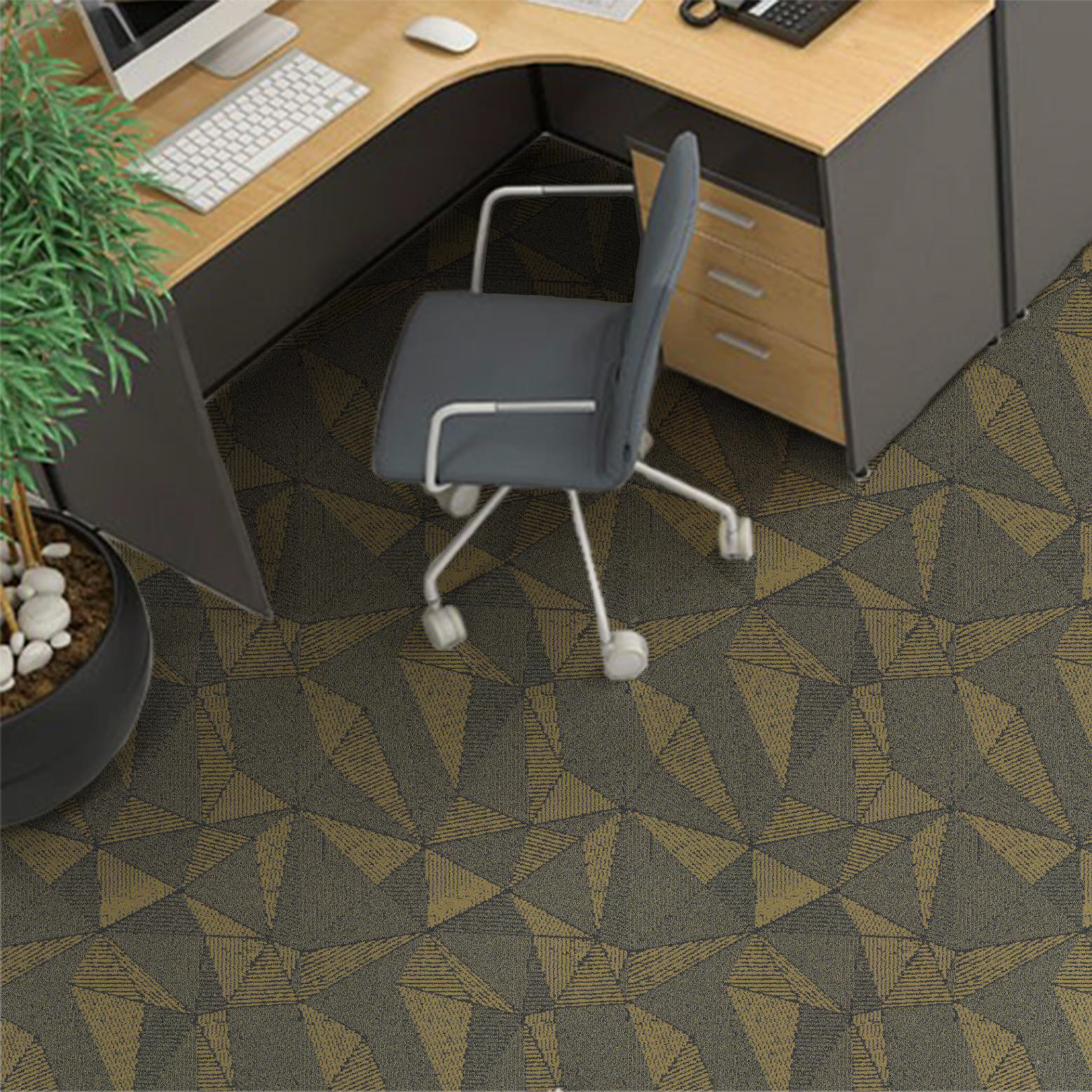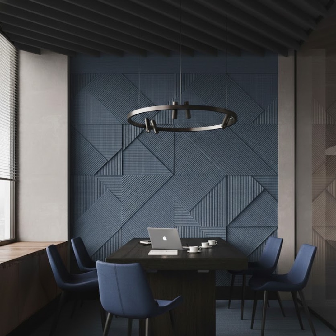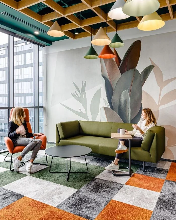
The best carpet tile colours for an office are a mid-tone base that disguises everyday soil, plus one or two accent colourways that mark meeting areas, cafés and routes. Choose the base for the busiest areas, add brand colour in small doses, and always judge samples on the floor, under the office's own light.
Colour is usually the first thing a client asks about and the last thing the design team settles, often from a small sample on a meeting-room table. That is how offices end up with a floor that looked elegant in the showroom and grubby by the second month, or a bold brand colour that tires everyone within a year. Carpet covers more of an office than any other finish, so its colour sets the tone of every room. A little method makes the choice far easier.
Five rules for office carpet colour
- Base first: pick the colour that will cover most of the floor before choosing any accent.
- Mid-tones with texture: they keep a busy floor looking clean between vacuums.
- Two or three colourways at most: more than that starts to look busy.
- Brand colours as accents: a strong colour works best in a small area.
- Test at full scale: a square metre of tiles on the floor tells you more than any sample card.
What colour carpet tiles hide dirt best?
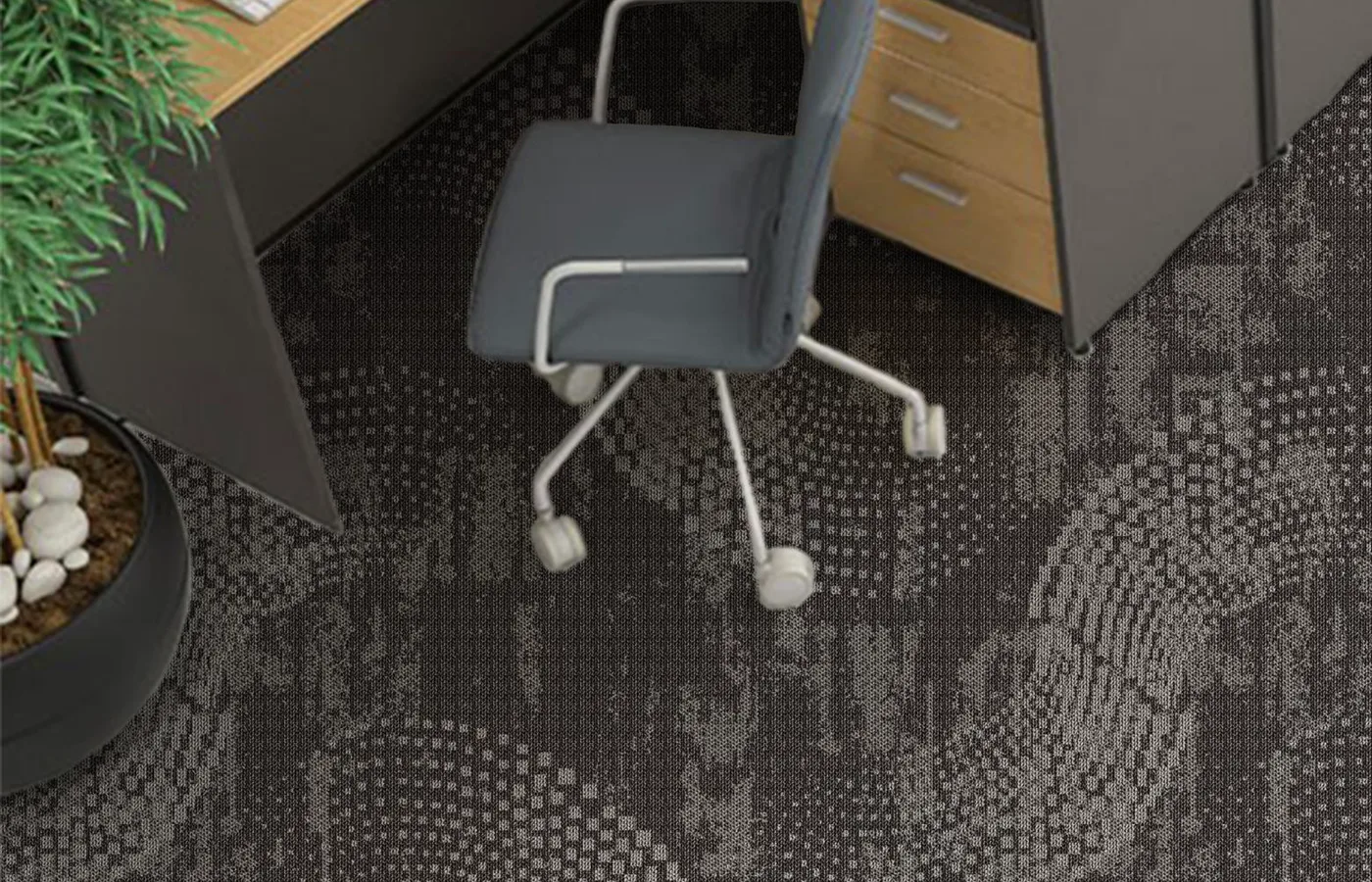
Mid-depth greys and taupes, especially in yarns that mix two or three tones. Soil in Indian cities is mostly fine, pale dust, so a near-black floor shows it as a grey film, while a pale floor shows the darker grime that collects along walkways. A tile with two or three tones in the yarn, or a small-scale pattern, breaks up both. Keep the darkest and lightest plain colours for rooms with little traffic. A good carpet tile cleaning routine keeps any colour looking its best.
Should office carpet be light or dark?
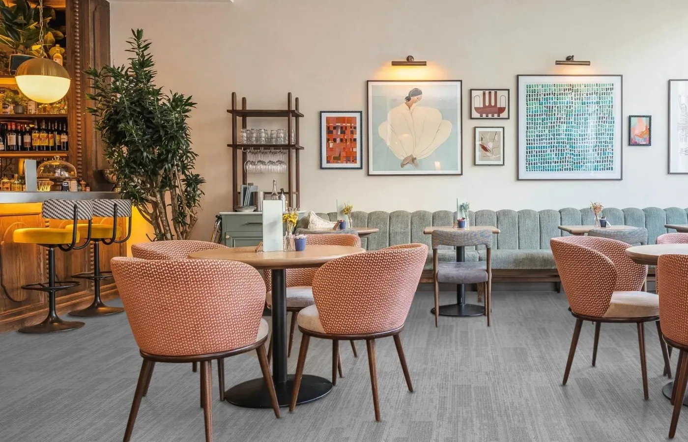
It depends on the room's light and size. A lighter floor bounces daylight back into the room, which helps deep floor plates and spaces with small windows feel brighter. A darker floor grounds furniture and makes a large, very bright floor feel calmer and more enclosed. Most offices settle on a base between the two and use lighter or darker tiles for particular zones. Check the walls and furniture at the same time, because a grey floor can read warm or cold depending on what surrounds it.
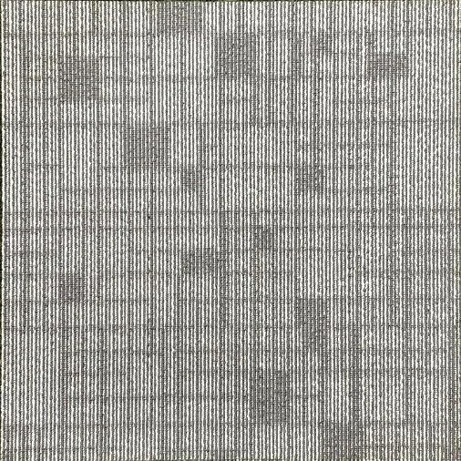
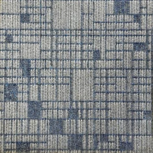
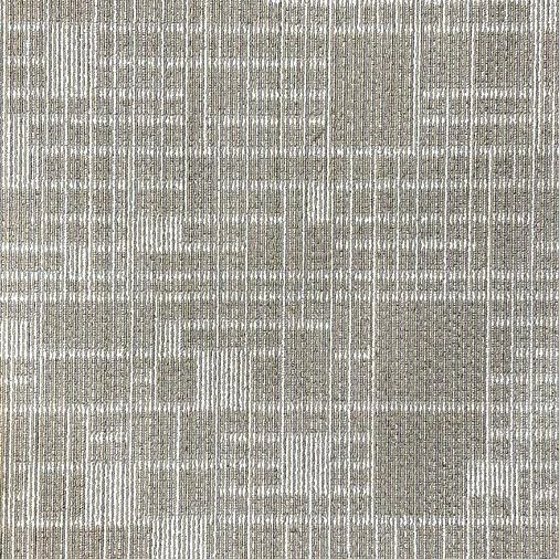
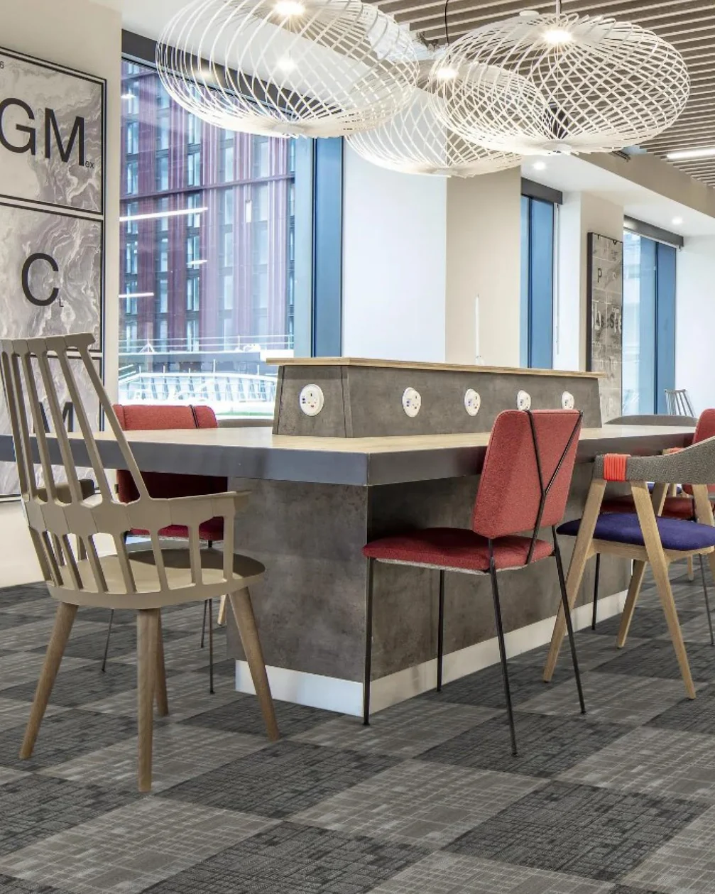
GAIA Gridwork in Light Grey, Blue and Beige: one pattern in three colourways, so a base and its accents belong together.
How do you use colour to zone an office?
Give each kind of space its own colourway, laid as a clear block. A collaboration area in a warmer or brighter tile reads as a place to talk; a focus area in the base colour reads as calm. Colour can also mark the main route through a floor, so visitors find reception, meeting rooms and the café without signs. Keep boundaries straight and aligned with furniture or ceiling changes, so the zones look intended. Choosing one collection in several colourways, as with the Gridwork tiles above, keeps the texture constant while the colour changes.
How do you build an office colour plan?
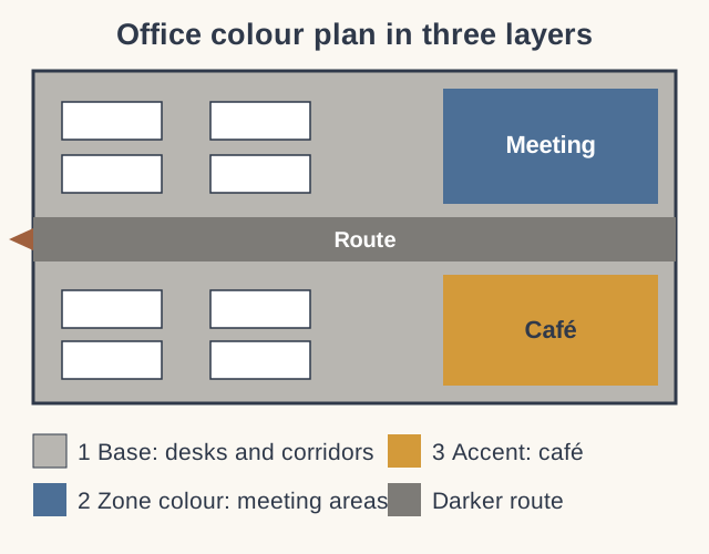
Work in three layers, in this order:
- Base: the colourway that covers the open floor and corridors, chosen for soil and light.
- Zone colour: a second colourway, usually from the same collection, for meeting areas, project spaces or a department.
- Accent: a small area of strong colour, often a brand colour, for the café, reception or a breakout area.
Mark each layer on the floor plan before choosing colours, then check that the accent is small enough to stay interesting. If the plan needs a fourth colour to make sense, the zones are probably too fragmented.
Can carpet tiles carry brand colours?
Yes, and they work best as accents rather than the whole floor. A brand red or orange across an entire office becomes tiring quickly and shows wear; the same colour in a café, a reception area or a block outside the boardroom says just as much. Where a brand colour is not available in carpet, pick the nearest neutral from the collection and carry the brand colour on furniture, walls or printed acoustic panels instead.
Does pattern matter as much as colour?
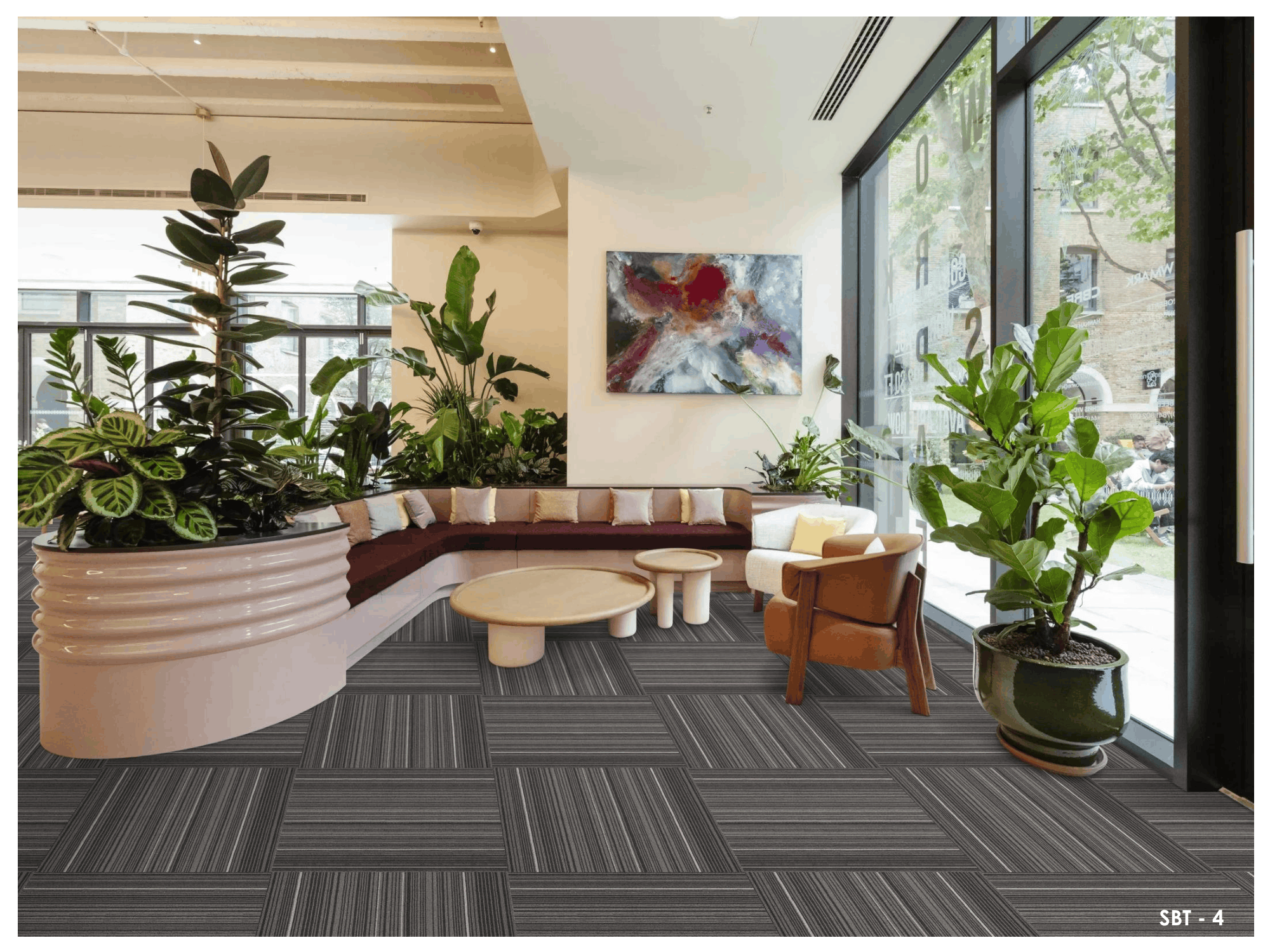
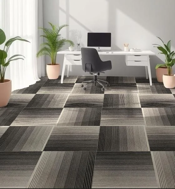
Nearly as much. A small-scale texture reads as calm from standing height and hides marks well. Stripes and directional patterns add movement, and how they are turned changes the result: laid in one direction they stretch a room, turned alternately they form a checked texture. Large, high-contrast patterns suit small areas such as a café, where they become a feature. The layouts each format can take are set out in tiles versus planks.
How should you choose carpet colours from samples?
On the floor, at full scale and under the office's own light. Lay out at least a square metre of tiles, which is four GAIA tiles, in the chosen layout, then look at it standing up, from across the room and at different times of day. LED lighting and daylight change how a colour reads, and a colour seen at arm's length on a table looks very different over a whole floor. Put a chair and a desk on the sample if you can. Browse the colourways in the GAIA carpet tiles range to build a shortlist first.
What to send us
- your office layout, marking any zones you have in mind;
- brand colours and the main wall and furniture finishes;
- photos showing the space in daylight and under its lights;
- the collections or colourways you have shortlisted.
Our team will suggest a base, zone and accent combination from the GAIA range for your plan.
Carpet colour questions
Why is grey so common for office carpet?
Because grey in its many shades sits well with most furniture and hides soil. Blended greys with a warm or blue undertone avoid the flat look of a single plain grey.
Can carpet tiles of different colours be mixed in one layout?
Yes. Tiles of the same collection and size can be mixed freely, from a simple checkerboard to blocks and random scatters.
Colour with a plan
Build your office carpet colour plan
Share your floor plan and brand colours with GAIA by Sanson Floorings, and we will suggest colourways for each zone of your office.